by Michelle Hespe
Leatrice Eiseman, executive director of the Pantone Color Institute and world-renowned color guru, speaks to Inspiration Magazine about how retailers can learn to spot emerging color trends, understand color “moods” and grasp how best to use them to their brand’s advantage.
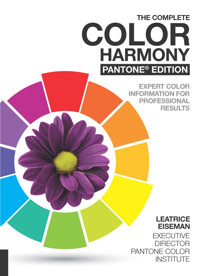
Leatrice has just released her 10th book on color — The Complete Color Harmony, Pantone Edition — which provides expert color information for professional color results. The book takes the reader on an enthralling journey through color spectrums, delving into the psychology behind hues and offering insight as to how color can be used to quite literally brighten up lives and the world around us by investigating color “moods.”
Keeping on top of color trends is crucial for retailers and product suppliers as brands are all competing with one another to grab the attention of potential customers and clients. And color, as Leatrice knows only too well, can influence a person’s behavior and thus their lifestyle choices and purchasing decisions.
“Some retailers are really good at picking up color trends and looking for emerging information, however, it does help to get some expertise from a professional,” Leatrice says. “As color forecasters, we are grounded in information about color and ongoing research—so I think it’s best to look for advice from those who work with color on a professional level. The Pantone View Home forecast is released annually and is really a concise package of color direction.”
A common question from retailers is how to best utilize color forecasts without taking the risk of conveying their brand as too similar to other companies adopting the same color palettes, especially in relation to competitors.
“Every retailer knows their target audience and/or the target consumer they are pursuing,” explains Leatrice. “So, it is a matter of selecting palettes that speak to their demographic and occasionally throwing some surprise colors or color combinations into the mix so that you don’t start to look ‘same-old, same-old.’ Sameness can be boring to the consumer and if bored, they will start to look elsewhere for something that will pique their interest. That is what trends are all about, and why it is important to be aware of them and to understand how to work with them.”
Leatrice goes on to explain that consumers might opt for buying the same kind of look they have gone with before, simply because it fits their current lifestyle and comfort levels, however, she says: “There is still a need to catch their eyes so that they pay attention to what you are presenting.”
In the wake of the annual Pantone color palette release and the much-anticipated announcement of the “Color of the Year,” it’s always interesting for those with a penchant for color to witness which palettes are widely adopted by brands and which ones pop up sporadically, or in small doses. These appearances are often related to current affairs and societal shifts, and their use can reflect the current mood of individuals or societies as a whole.
For instance, as more people make changes to live more sustainably and in turn help to preserve the world around us, the “Verdure” Pantone color palette released this year struck a chord with companies and the public, making appearances in everything from homewares to fashion, food branding and the design of public spaces.
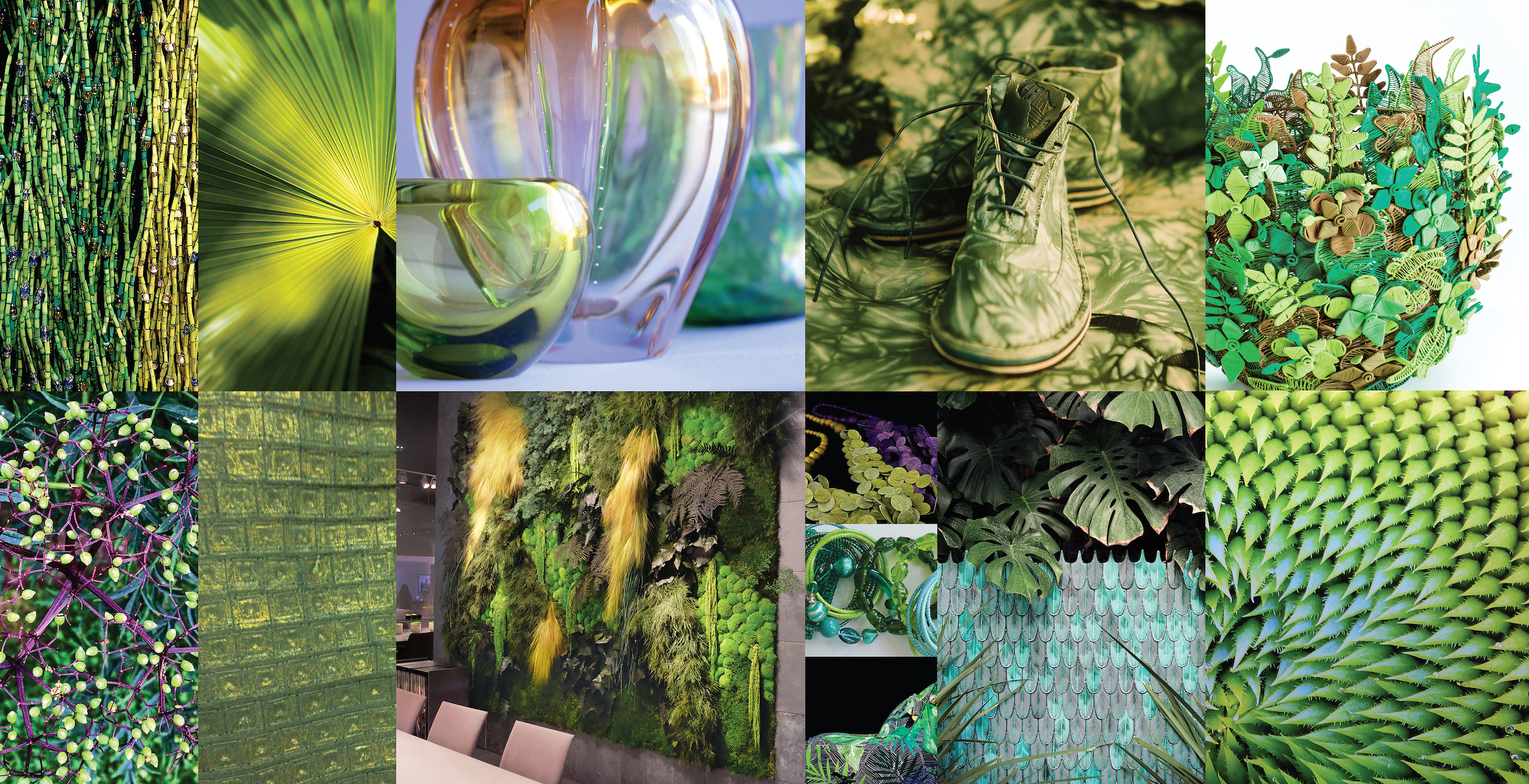
“There is no question that the Verdure palette speaks to the many environmental concerns that people have,” says Leatrice. The first sentence of the palette’s explanation reads: “Verdure is all about the continuing, vigorous quest for well-being, with a profusion of greens expressing health, abundance and vitality. We wish the same well-being to the life and preservation of our planet.”
For Leatrice, being so steeped in color every day of her life, revelations such as the Verdure effect are more like an acknowledgement of trends that she is seeing, rather than them coming as a shock or surprise.
“However, it is always interesting, and validating, to see how the Color of the Year starts to emerge during the course of the year in so many places—not only in fashion and home furnishings, but other areas such as print, advertising, packaging, display, even stage lighting and/or electronics,” she says. “That certainly has been happening with our Color of the Year for 2017—Greenery.
“There are many different taste and comfort levels present in people that will make some consumers respond to one palette more than another,” she explains. “As a reaction to frenetic lifestyles and schedules, for instance, some might prefer a softer, quieter palette for the home, such as ‘Discretion’ (includes soft hues of Elderberry, Burnished Lilac and Hawthorne Rose) that allows them to decompress while at home. Others, especially if they have young families, might prefer a more ‘Playful’ outlook (a fresh combo of lime green and bright yellow—think Minions).”
So for Pantone, it’s not about picking one special palette and indicating to retailers that this is the direction to take. “This is why we create eight palettes for the Pantone forecast—to give a general direction,” she says.
A hands-on way for anyone to witness color trends popping up across the world like fresh new growth is to travel. “There are so many possibilities for seeking out emerging color trends in every area of the world,” says Leatrice. “The worlds of art and entertainment and upcoming sports events are always great indicators, as well as fashion and cosmetics, not only at the top strata but also what’s on the street. Technology and special effects enabled by new technologies are also excellent indicators. When it comes to spotting emerging color trends, it’s important to take in all of these areas and not limit yourself just to the sector you are involved in. Get out there and explore!”
To learn more about Leatrice Eiseman’s presentations, revealing the 2019 Pantone Color Palettes and discussing the “guidelines to color harmony,” at the 2018 International Home + Housewares Show, visit www.housewares.org/show/keynotes.
To learn more about Lee and to see her color blog, visit Leatrice Eiseman. To learn more about Pantone, visit www.pantone.com.
Read the next Inspiration Magazine article – Discovering Design: THAT! Inventions.
